Introduction
A CIO leading a multi-billion-dollar digital transformation wisely defines her remit as delivering “scale, speed, security, and stability”. That, of course, defines desired outcomes from the hundreds of initiatives categorized under buzzwords like “projects to products”, “going agile”, “cloud native”, “analytics & AI/ML”, “customer first”, and “consolidate & simplify”. These themes overlap with regular themes like stability & resiliency, delivery excellence, and workforce effectiveness.
CIOs and other digital leaders thus face two challenges
- How does one inspire an organization to transform when these objectives/concepts are so nebulous and uncertain?
- How can one build momentum & track progress across their organizations against such fuzzy objectives?
CIOs often address these challenges by turning to metrics and dashboards to increase the clarity & specificity of objectives, build momentum & track progress. In essence, just like airline pilots, they want a cockpit instrument panel to help manage the transformation journey.
Building such an instrument panel (“digital dashboard”) requires answering 4 sets of questions
A.What exactly do the themes mean for their firms, and how do they manifest as metrics? What are their relative priorities?
- Identical themes may manifest differently across companies given their respective starting points, destinations, and specific journeys to those destinationsB.Does the data driving these metrics exist in a usable form? What is the quality of that data? What proxies/ approximations will suffice?
- Most IT organizations are, ironically, not well endowed with information about themselves, particularly so about new or nascent concepts (e.g., going Agile).
C.How can the dashboards be designed to be insightful, useful, and widely adopted? What does good or good enough look like?
D.What are the approaches to building, evolving, and sustaining them over time?
As we shall see, building effective dashboards that help executives drive such complex agendas requires insight and analytical depth, creativity, deep executive engagement, and a product management mindset, all of which make this different from “regular” operational dashboards.
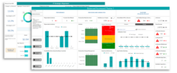
Exhibit 1. CIO Dashboard Samples
Manifesting Transformation Themes
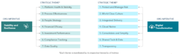
Digital transformation themes & objectives should reflect priorities as shared in company strategy and investor communications; other themes can often be grouped under the new themes, reframed, or deprioritized, but clarity and alignment on the final themes and their hierarchy are critical. Depending on the context, themes can vary in their specificity & aspiration. For example, the left side of Exhibit 2 illustrates a scenario where platform stability was the overarching criterion, while the right side illustrates a case where large-scale organizational transformation was the key objective.
Ambiguous themes/objectives often require brainstorming sessions with senior executives for clarity & alignment to emerge amongst the executives themselves. For instance, “agility” can mean Agile metrics (like backlog health) and/or greater responsiveness of the organization (e.g., age of open positions).
Summarizing these themes/categories and metrics into a “metrics tree” then defines the aspiration for the digital dashboard, which will then be prioritized & realized over several iterations. Judging how broad and deep such a tree should be to be useful requires effective buy-in from senior leadership.
Exhibit 2. Organizational Imperatives Drive Transformation Themes & Metrics
Data Availability and Quality
Most IT organizations struggle with capturing, analyzing, and using information about themselves, even for regular operational functions. As a result, many IT functions often lag their business and operations partners in the use of analytical data to drive decisions. IT leaders are often acutely aware of that situation but struggle to overcome the underlying causes within their functions: fragmented, less mature processes and systems, and the qualitative (as opposed to quantitative) nature of decision-making.
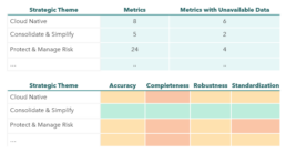
Even when data exists, they may not be deemed robust. Hence, assessing the source, quality & frequency of the data underlying the selected metrics is important to build trust in them when they are presented. We have found that including metrics on data quality itself becomes a key component of building credibility for the dashboard and simultaneously increasing the organization’s maturity; Exhibit 3 illustrates such metrics and the implied level of maturity of the function/process. A key benefit of dashboards is insight arising from the integration of multiple data sources; that integration, however, is often impeded by the lack of standardization of key terms and data (e.g., which projects are really “strategic”), and of actual linkages across data sets (e.g., which servers map to which applications).
In many cases, the metrics and data are truly new for the organization, e.g., it is hard to have metrics on Agile performance if one just started the journey. In such cases, alternate and proxy metrics can be used in the early stages, to be superseded later by “proper” metrics with more robust data.
In the end, it is the availability and quality of the data that will determine which themes are manifested by which metrics (and by when). Aligning with the CIO team on a real metrics tree (as opposed to an idealized one) is key to setting the right expectations and providing a firm basis for the design and build of the CIO dashboard.
Exhibit 3. Data Quality Metrics
Designing for Insight and Adoption
Most people find it hard to specify what they want when it comes to data visualizations but can easily judge whether a visualization is insightful or useful. For CIO dashboards, deep experience in IT strategy becomes key to selecting meaningful metrics and effectively designing visualizations. In our experience, effective dashboards also
- Share information hierarchically. A “one page” balanced scorecard is followed by theme-specific and then function-specific metrics
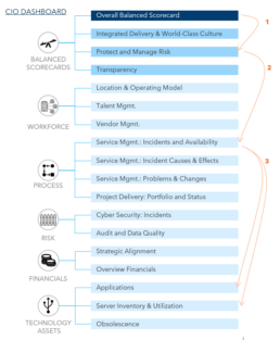
- Allow executives to interrogate the dashboards via filters, drill-downs, etc. Insightful dashboards raise many questions, and to be more effective, they allow the CIO to answer “why” at 2-3 levels of depth (enough to identify whom to call to address the issue). Exhibit 4 illustrates such a scenario where the CIO team proceeds from the “landing page” of the CIO dashboard to theme-specific details and then to deeper functional levels, all within the same dashboard (via different tabs and links)
- Address key economics of the IT functions, e.g., finances, operating models (people, vendors, locations), projects, and assets
The most important element for adoption is, of course, for the CIO to normalize the use of the dashboard in regular review and decision processes, both in group and individual settings. Cascading select metrics and dashboards deeper into the organization will also make transformation real for others. In all cases, it is important to remember how anxiety-inducing clarity & transparency of performance can be for people.
Exhibit 4. Effective CIO Dashboards Answer “Why” at 3 levels
Building and Sustaining a CIO Dashboard
Creating CIO dashboards involves simultaneously addressing the ambiguity of objectives & intent, the absence of key data, and the need for insightful presentation. Successful deployment of CIO dashboards requires a combination of a strategic mindset with product management discipline, along with support from the CIO. It also requires rapid but iterative delivery of dashboard features to build momentum for its usage and its underlying data processes.
Initial versions of CIO dashboards often generate a lot of interest and excitement, as data and analysis executives “always wanted” is presented in an integrated and useful way. And even early versions of dashboards can quickly help identify and drive meaningful changes in the organization. In our experience, visualizations showing the extent of underutilization of infrastructure assets or the degree of fragmentation of the delivery model quickly start to drive changes in behavior.
Delivering the full promise of the dashboard, however, requires addressing the barriers to the availability of robust data underlying the metrics. Those barriers can be across systems, processes, or data management, and require concerted efforts to break through. For example, data for Agile metrics may be originating in Jira, but that data may not have been fed into the data warehouses on a normal basis.
Or, data may not exist within the IT function and would need to be brought in, e.g., data on external resources from offshore firms (by role, location, project/product, etc.) which would be key to understanding the fragmentation of the operating model.
Building the plumbing to integrate and “productionalize” the data sources for the CIO dashboard can be a material effort, but it pays quick dividends, not least in increasing the maturity of the IT function as a whole. In a sense, the instrument panel prevents one from “flying blind” during the transformation.
Three additional factors sustain the CIO dashboard over time
- Applying the same product management discipline to the dashboards as that for any other product: ensuring ongoing & increasing usage by the CIO team and evolution of the metrics, data feeds, and visualizations to support emerging needs
- Cascading relevant parts of the dashboards further down the organization to build greater alignment, make the transformation more tangible and demonstrate that data being generated across IT is to be taken as seriously as any other.
- Incorporating these dashboards into the discussions of the CEO team, the Board, and even regulators will embed the dashboards in the organization and drive improved perceptions of IT function maturity and capability
In Closing..
Tracking transformative change is difficult by definition – the direction & destination may be ambiguous, and the data needed may not exist because the organization may not have ever done what is being asked for now. While the need for an instrument panel to help guide and manage the transformation journey may be obvious, building one requires strategic insight, analytical depth, creativity, deep executive engagement, and a product management mindset.
Today, every C-level executive needs an insightful dashboard to help navigate the business. Some firms are lacking data, and others are overloaded with information that is not ‘actionable’.
A simple, effective, insightful, predictive C-level dashboard and the right management processes (for performance and execution management) separate the winners from others.
__________________________________________________________________________________________________________
Read More

From Interface to Intelligence
The next frontier of digital commerce is not better checkout, but better coordination. This whitepaper examines how agentic AI is transforming fragmented transactions into intelligent, autonomous experiences - and what businesses must do to stay ahead.


Banking on You – Personalization in Financial Services
Capturing and sustaining attention is key to building customer loyalty, driving sales, and standing out in a competitive landscape. In this attention economy, what really helps business maintain relevance is to personalize the interactions for their needs, context and preferences.

The Open Book on Compliance – US Open Banking Regulations Decoded
The CFPB’s new Open Banking regulations will impact how financial service providers can access and monetize consumer data, while also influencing future practices around security, consent, and data sharing.

Mixed Reality
As these technologies become more accessible to the wider public, AR and VR are expected to grow into a $125 billion market by 2025.

Money Games
The use of gamification has proliferated across all industries, with retail, entertainment and education leading the charge. Apps like Duo Lingo, Kahoot, Fitbit, Starbucks etc., are all some of the most prevalent examples.

Monetizing Data Analytics
For several years, it has been said that “data is the new oil” and arguably, the most valuable strategic asset for a business. Whilst getting value out of data might be less straight-forward, it is true that data needs to be refined to make it valuable.

From Cards to Chains – Payments in the Blockchain Era
To remain competitive in the evolving financial landscape, card networks are uniquely positioned to bridge this gap between traditional payments and new blockchain networks as transaction facilitators, leveraging their global reach to make transactions on their networks quicker, cheaper, and more secure.

A Borderless World
Significant shifts are underway in the cross-border payments sector, across the demand-side and supply-side. Consumer expectations from domestic payments (instant, fully traceable, risk-free, etc.) are being applied to the more complex cross-border space. Businesses that capitalize on these shifts stand to shape the future of the industry.

Cracking the FedNow Code
Real-time payments are increasingly recognized as a critical component of modern financial systems, offering speed and convenience in an interconnected digital world. As we venture into the future, the recent launch of the Federal Reserve's instant payment service, FedNow, stands at the forefront of a payment revolution in the US.

Future-Proofing Healthcare Delivery
The right telehealth platform is critical to meeting patient expectations and providing the best possible provider, patient and administrator experience. Today patients are demanding more control over their healthcare and want to access care from anywhere.

The GenZ Wave
Gen Z is not merely a younger version of millennials; they are poised to disrupt all aspects of the economy. Companies must therefore adapt in time to cater to the preferences and expectations.

Gaming and Financial Services
As younger generations start to play for competition and skill development, there is a rise in payment flows, volumes, and subsequent opportunities arising out of the same. Financial institutions are not only presented with the opportunity to monetize on gamers but also target younger Gen Z and Millennial consumers to upsell and cross-sell their existing products.

Maximizing Value from Value Added Resellers
The role of Value Added Resellers (VARs) is transforming from basic reselling to strategic technology partnerships that offer comprehensive IT solutions. To maximize the value of these evolving relationships, firms must bring transparency to pricing, agreements, and the scope of work.

Latent Growth in LatAm Credit Cards
The payments industry has been experiencing explosive growth across Latin America over the past few years: cash usage has decreased ~20% as consumers pivoted towards payment products that are well integrated into the financial ecosystem.

Navigating the Buy Now Pay Later Era
The rising aspirations of consumers combined with the limited access to, and opaque nature of traditional financing solutions, has given rise to innovative products for underserved segments. BNPL is one such solution that offers short-term financing to users with the ability to pay in definite installments with low to no interest rates.

Modernizing B2B Client Delivery
Leading B2B firms are very well aware that their client delivery experience needs to have the same levels of service, responsiveness, transactional ease as any digital consumer experience. Majority (72%) of B2B buyers expect a similar experience on a B2B site as they get on a consumer website (1).

Winning in Mature Markets
Competition is an important facet of business world, and the process of seeking growth is a continuous one. One should never stop trying to win new customers or retain existing ones. After all, competitors are always trying to win your customers over, especially in mature markets.

Putting Customers At The Core of Your Business
Digital Transformation is about developing new capabilities and leveraging new channels to design and deliver a better client experience.

Realizing the Reality of Real Time Payments
Real time payment (RTP) transactions are likely to exceed 300B by 2023, growing at 40% per year worldwide. Financial Institutions need to quickly find their own space in this ecosystem. They must redefine their value proposition and rethink their business models around this phenomenon.

Client Loyalty 2.0
We are on the cusp of a revolution within financial services that will have far-reaching ramifications for the +1 billion unbanked, current models of financial intermediation across entities and borders, and ultimately the very nature of how end-consumers understand financial health. As this understanding held by customers evolves, so too must the operations, services, and visions of providers.

The Tale of Two Countries – Insurance
The pandemic has created unprecedented challenges for the insurance industry. Experiences of the world’s biggest economies (U.S. & China) offer valuable lessons as to where the industry can improve and change in order to better handle similar events in future and build sustainable risk management systems.

Path to Innovation
Innovation has been in vogue for over a decade but the need to be innovative has never been felt as strongly as today. As businesses are learning to thrive under the lasting effects of the pandemic, they need to reinvent products, services and customer experiences to satiate emerging patterns of demand. To truly capitalize on the opportunity, business leaders need to look beyond internal capabilities and embrace a networked model of innovation to drive positive impact.

Reimagining Marketing
The COVID-19 pandemic has re-shaped the landscape for marketers. They are not only forced to cut budgets to save costs, but also face the challenge of keeping up with new emerging customer behaviors. These unprecedented changes call for a broader shift in marketing tactics and investments to successfully navigate the current transformed landscape.

Age of Contactless Mobility
Cities are at a standstill, but they are bound to get moving again. Urban mobility will never be the same, and contactless payments will shape the new normal. Trends are shifting, preferences are being broken, and opportunities abound!

The Path to Decentralized Finance
We are on the cusp of a revolution within financial services that will have far-reaching ramifications for the +1 billion unbanked, current models of financial intermediation across entities and borders, and ultimately the very nature of how end-consumers understand financial health. As this understanding held by customers evolves, so too must the operations, services, and visions of providers.

An Agile Approach to Digitalizing Wholesale Banking
Credit has seen its fair share of ups and downs, from being the crux of financial services, to commoditization and mass distribution, to now being re-engineered. In the realm of Wholesale Credit, a revolution is underway.

Driving Productivity Through Systems Selection
Procurement often involves multiple disparate stakeholders, systems and protocol. This complexity results in increased reliance on inefficient sourcing processes and only partially takes advantage of all the benefits available from supplier competition.

Putting IT Infra Consumers on a Diet
One question seldom asked is “how do I put my (IT infrastructure) customers on a diet?” The demand side is often assumed as a given, and there is with little assessment of (over-) consumption by applications.

Smart Blockchain Contracts: Are We Finally Going Paperless?
Smart contacts offer the potential to facilitate or fully automate processes that are heavily paper-based today, particularly long-winded, expensive legal processes.

The Unbundling of Retail Banking
Not unlike a piece of software, retail banking can be portrayed as a stack comprised of 3 layers, where the complexity of each services can be abstracted into discrete segments and end products.

Binge-Worthy Digital Advice
While the trajectory of ‘digitization’ in financial services is encouraging, there is still significant demand from customers to expand and evolve their digital experience.